140 screens
3 breakpoints
1 booking flow
Adventure travel is an emotional purchase, but booking it is full of practical questions: how hard is it, what's included, what do I need to bring?
Designing for discovery
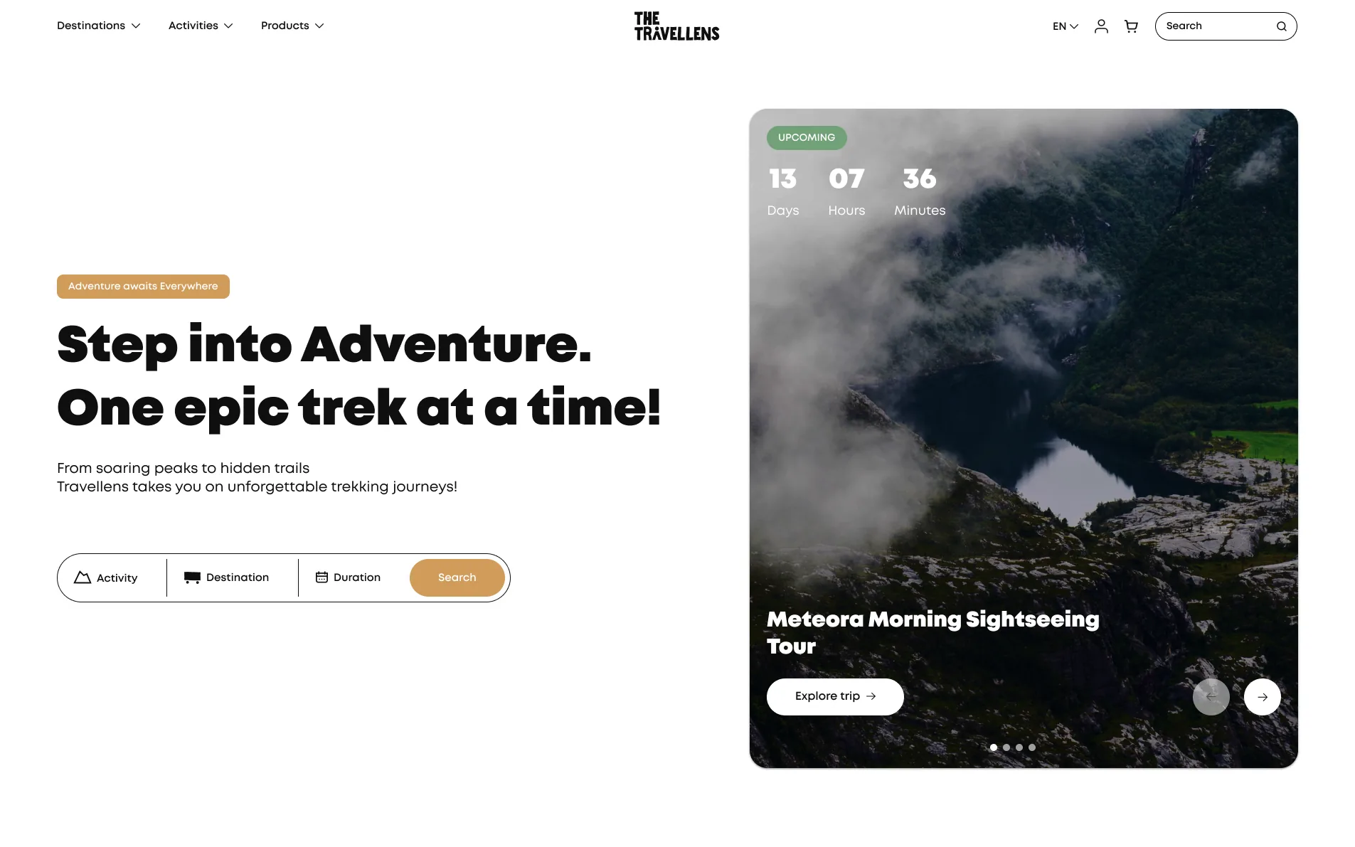
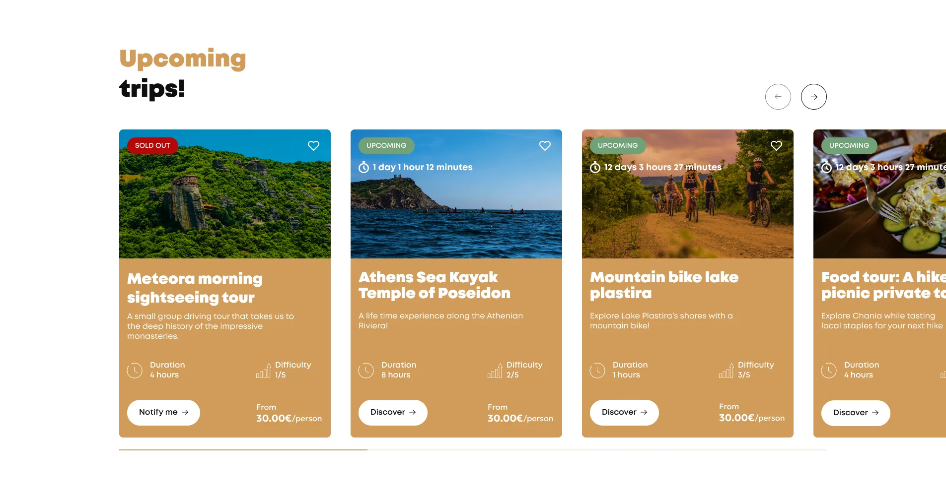
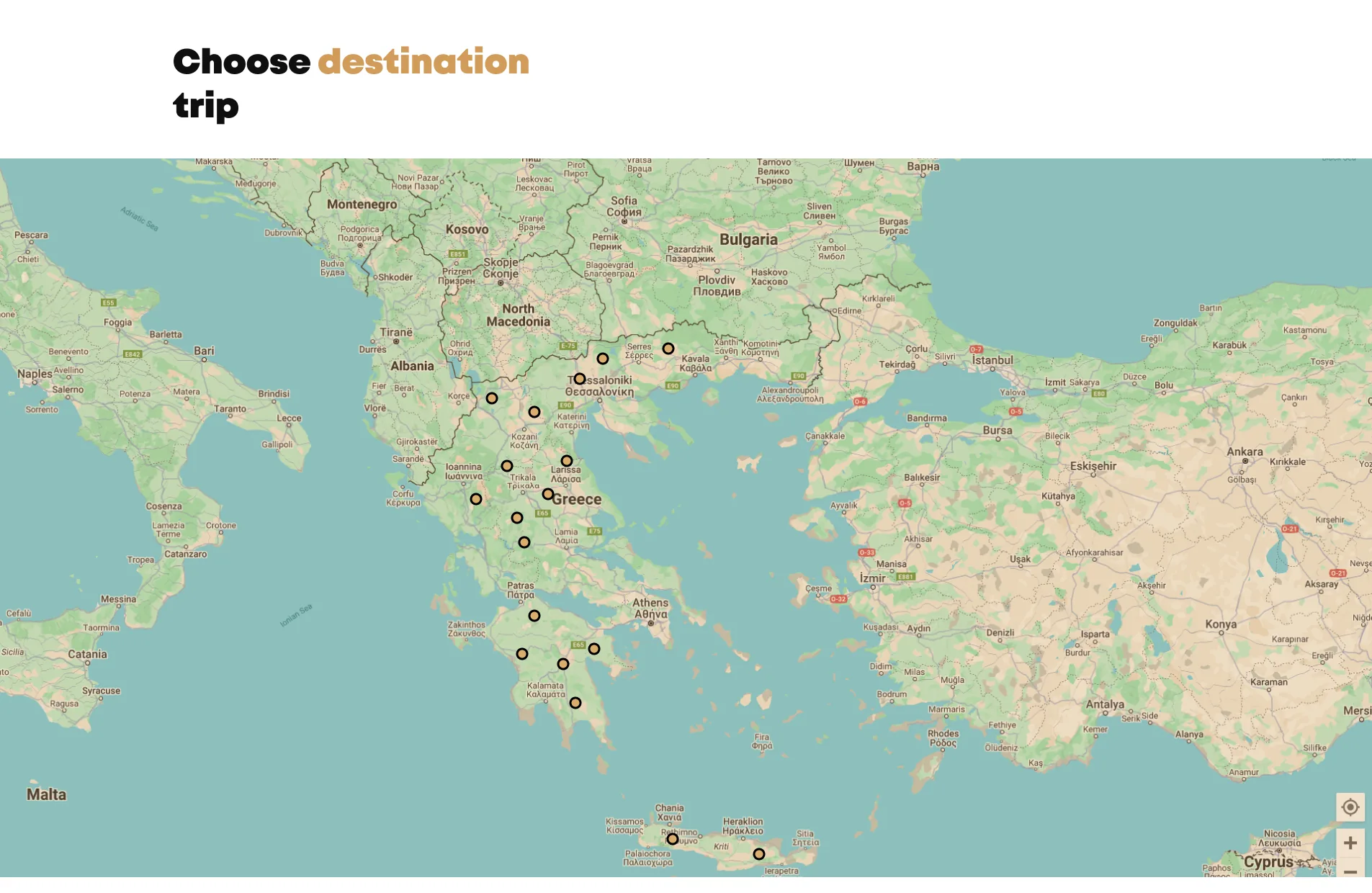
Most travellers don't arrive knowing which trip they want. The landing page leads with a simple search by activity, destination and duration, an upcoming-trip spotlight with a live countdown, and a map of destinations across Greece.
Every trip card answers the first questions at a glance (duration, difficulty, price and availability), so travellers can compare options before committing to a page.
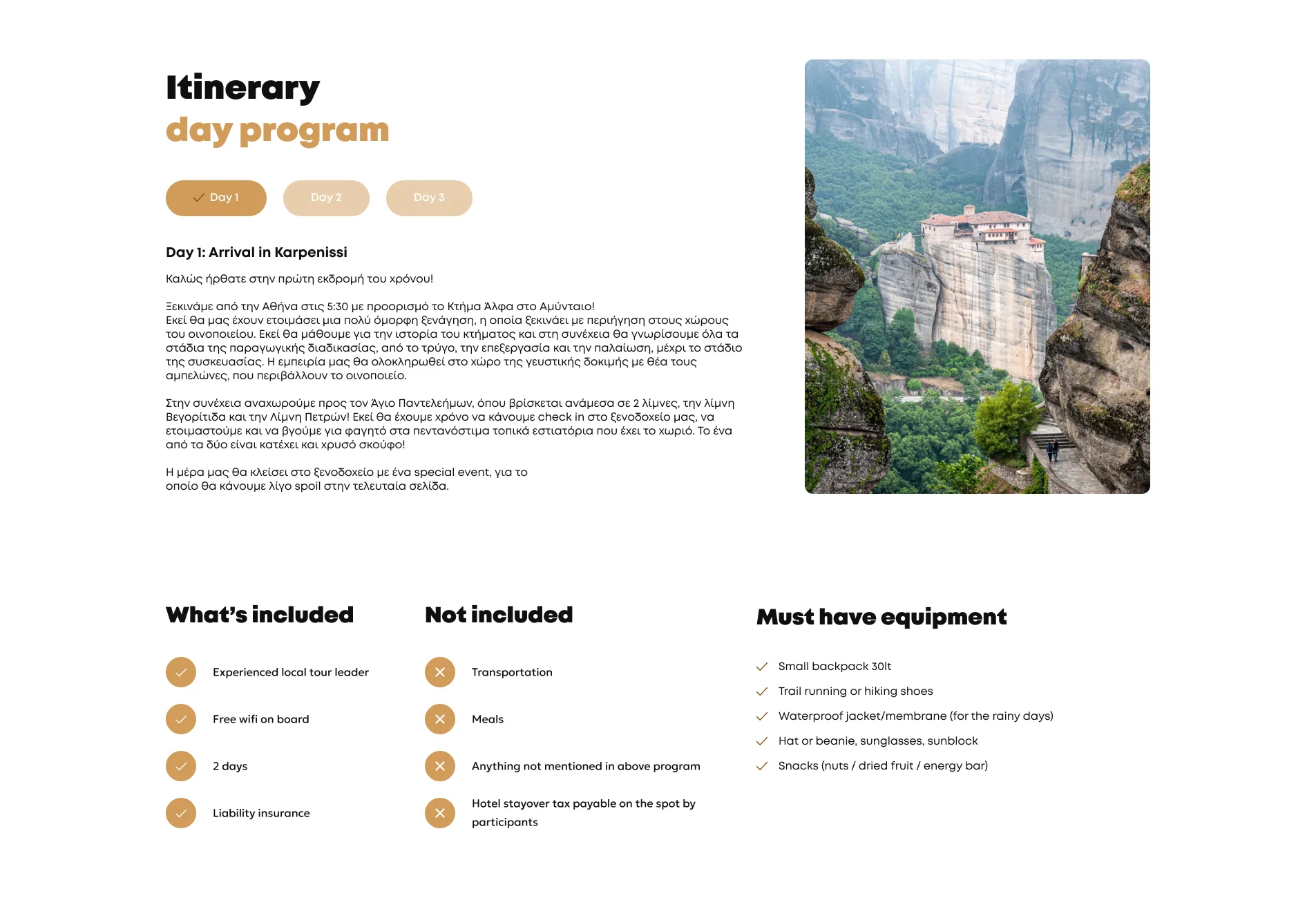
One page with everything a traveller needs to decide
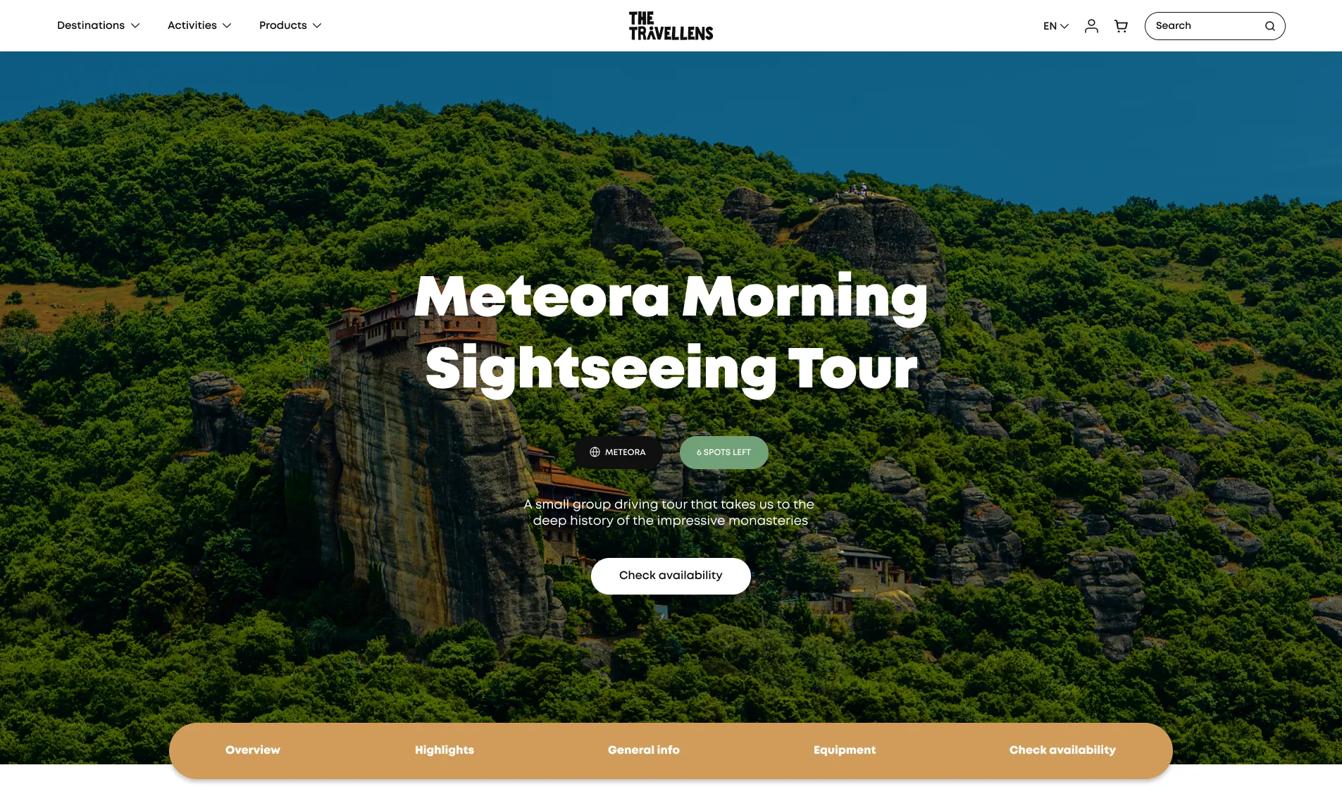
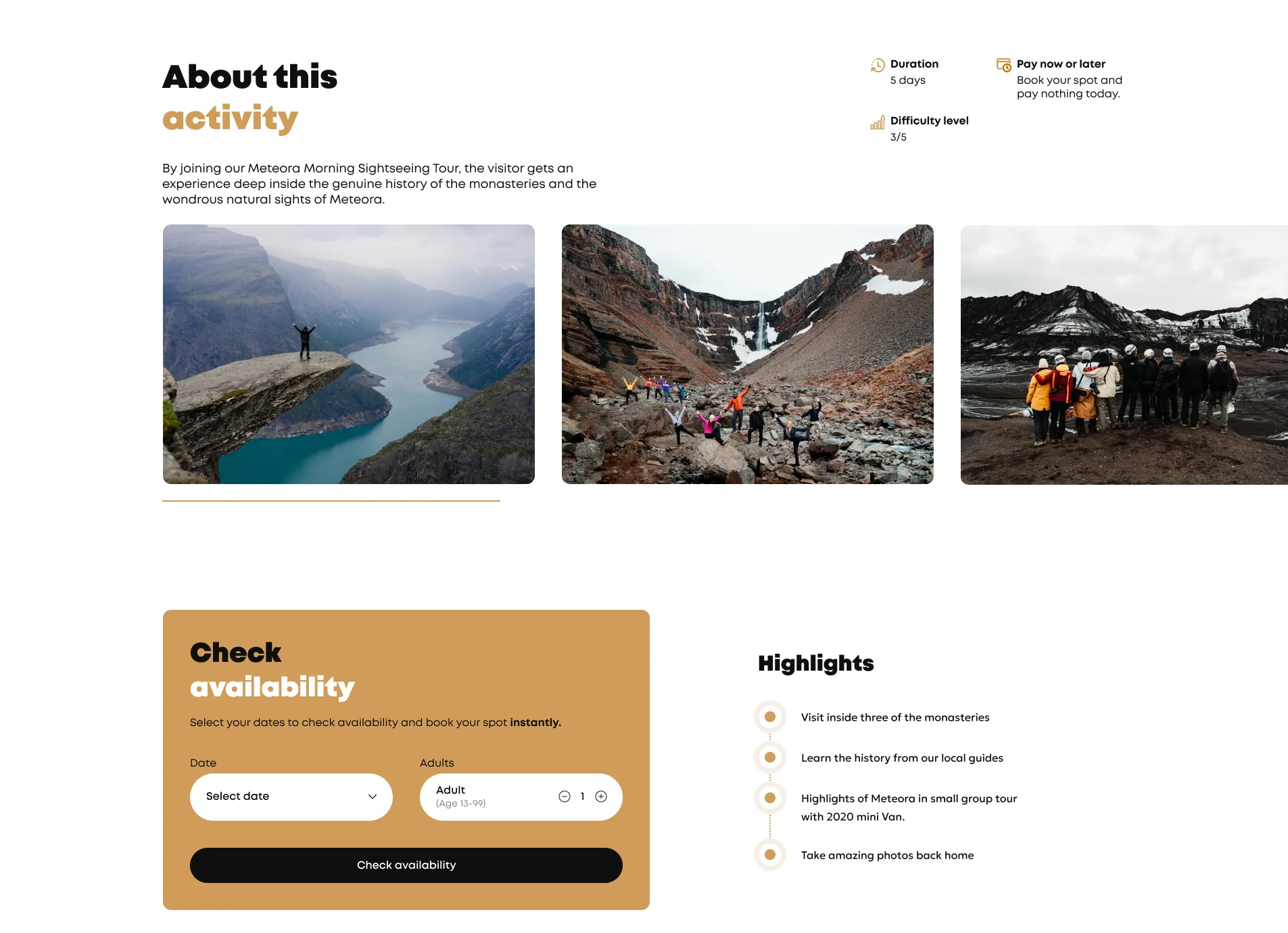
The trip page brings together the overview, highlights, a day-by-day itinerary, what's included and what's not, the equipment needed, and an FAQ.
Availability is checked right on the page, so the path from “this looks amazing” to “I'm going” stays short.
Booking without leaving the trip
The dilemma
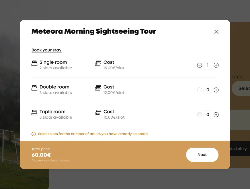
Booking a trip involves dates, participants, rooms, personal details and payment. Sending travellers to a separate checkout risked losing the excitement built on the trip page.
The decision
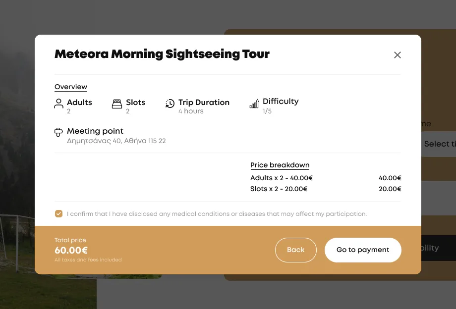
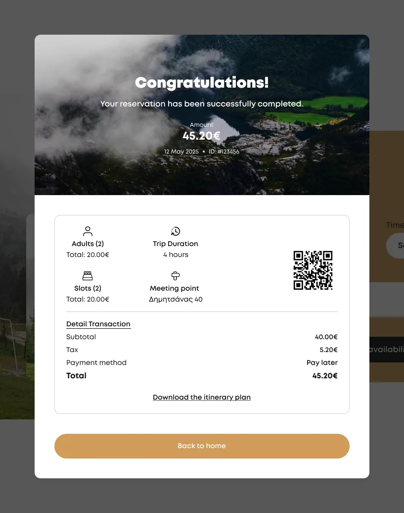
Together with the client, we moved booking into a focused popup on top of the trip page, split into four short steps: stay, overview, details & payment, confirmation.
Why it mattered
Travellers keep the trip in context while booking, and each step asks for only a few things at a time, which makes a long form feel light.
Trade-off accepted
More states to design and build per step, in exchange for a clearer, calmer booking flow.
Lowering the cost barrier with installments
The dilemma
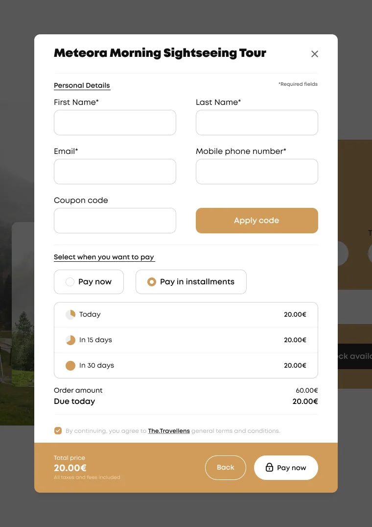
Multi-day trips are a significant expense, and paying the full amount upfront was a likely reason for travellers to postpone booking.
The decision
We proposed, with the client, a pay-in-installments option next to paying in full: a third today, a third in 15 days and the rest in 30 days, shown clearly before payment.
Why it mattered
Seeing “due today” instead of the full price makes the decision to book easier, while the schedule stays transparent.
Trade-off accepted
A more complex payment and order state, in exchange for a lower barrier to booking.
Giving travellers a reason to come back
The dilemma
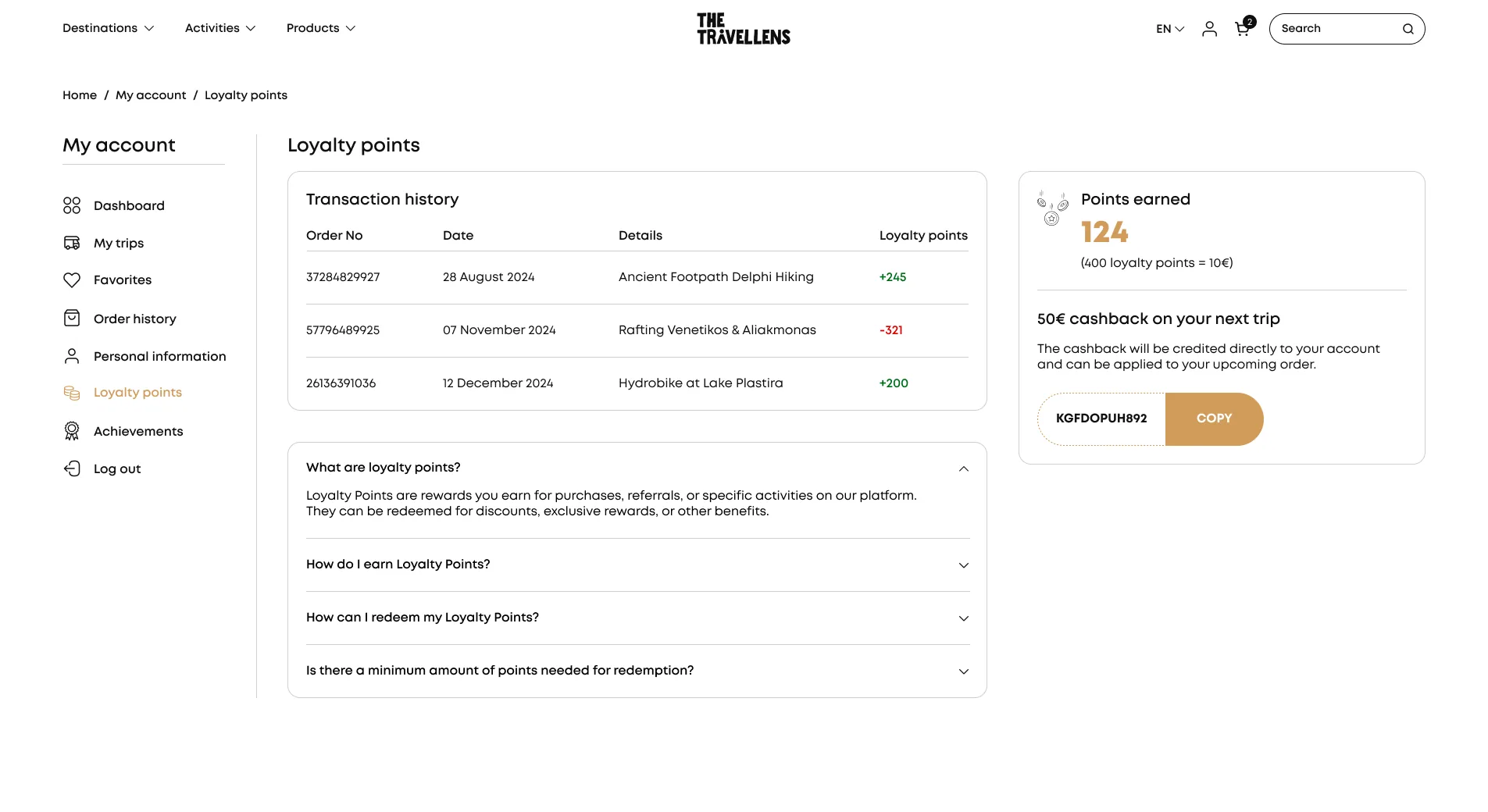
Adventure trips are booked a few times a year at most, so there is little natural reason to return to the platform between trips.
The decision
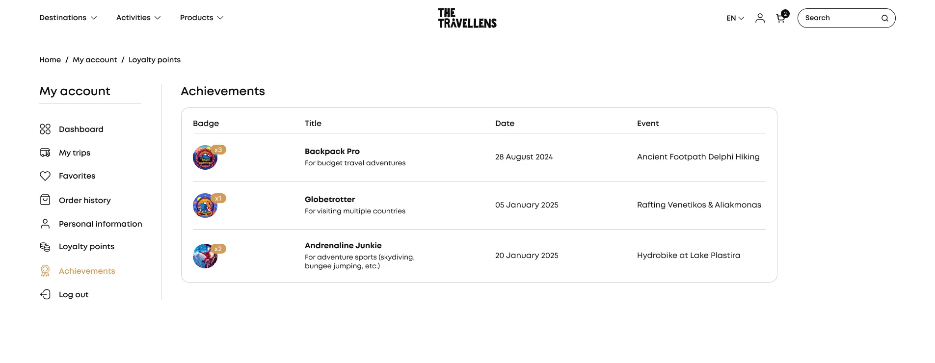
Together with the client, we added loyalty points that turn into cashback for the next trip, and achievement badges (like Backpack Pro or Globetrotter) earned through trips.
Why it mattered
Points give a practical reason to book again, and badges turn past trips into something travellers want to collect and share.
Trade-off accepted
A bigger account area to design and maintain, in exchange for long-term engagement.
Selling the gear the trips call for
The dilemma
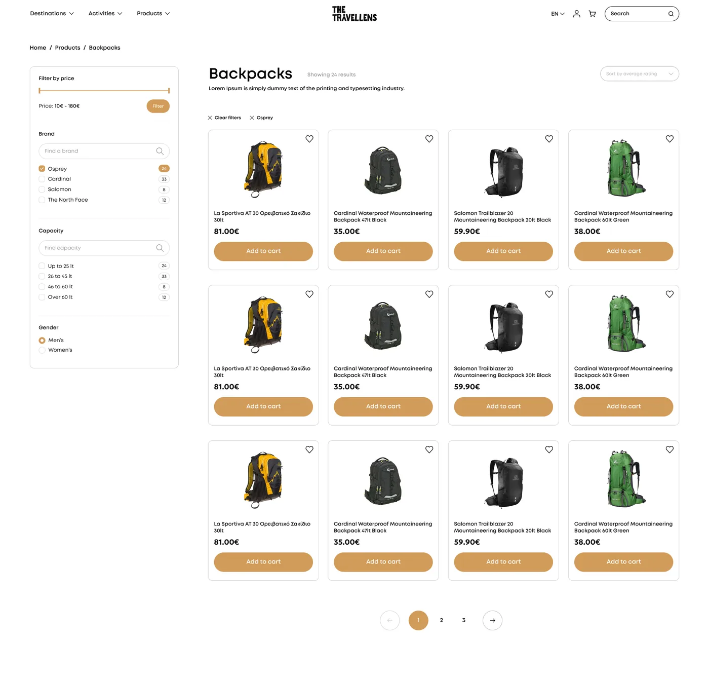
Every trip page lists the equipment travellers need, but they had to find it elsewhere.
The decision
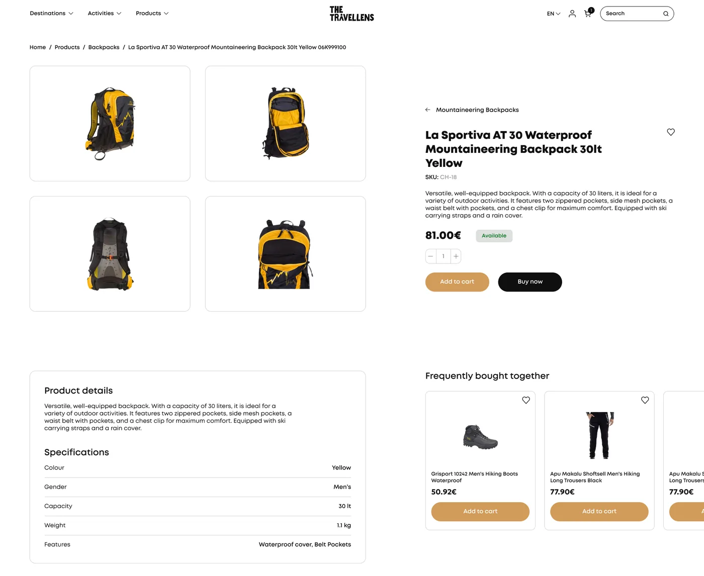
We designed an e-shop for trekking gear that lives next to the trips, with filters, product pages, cart and checkout following the same patterns as booking.
Why it mattered
Travellers can prepare for a trip in the same place they booked it, and the client gains an additional revenue stream from the same audience.
Trade-off accepted
A wider scope for the first release, in exchange for a complete travel-and-gear experience.
Status & learnings
The platform is currently in development and hasn't launched yet. Once it's live, booking completion and the share of installment payments will show how well these decisions work.
Designing 140 screens across desktop, tablet and mobile reinforced the value of a consistent system: cards, popups and account pages share the same building blocks, so new trips, products and features fit in without redesigning. Shaping the key decisions together with the client kept the product grounded in how their travellers actually book.