6 pages
2 audiences
Field to jar
Letting the place tell the story
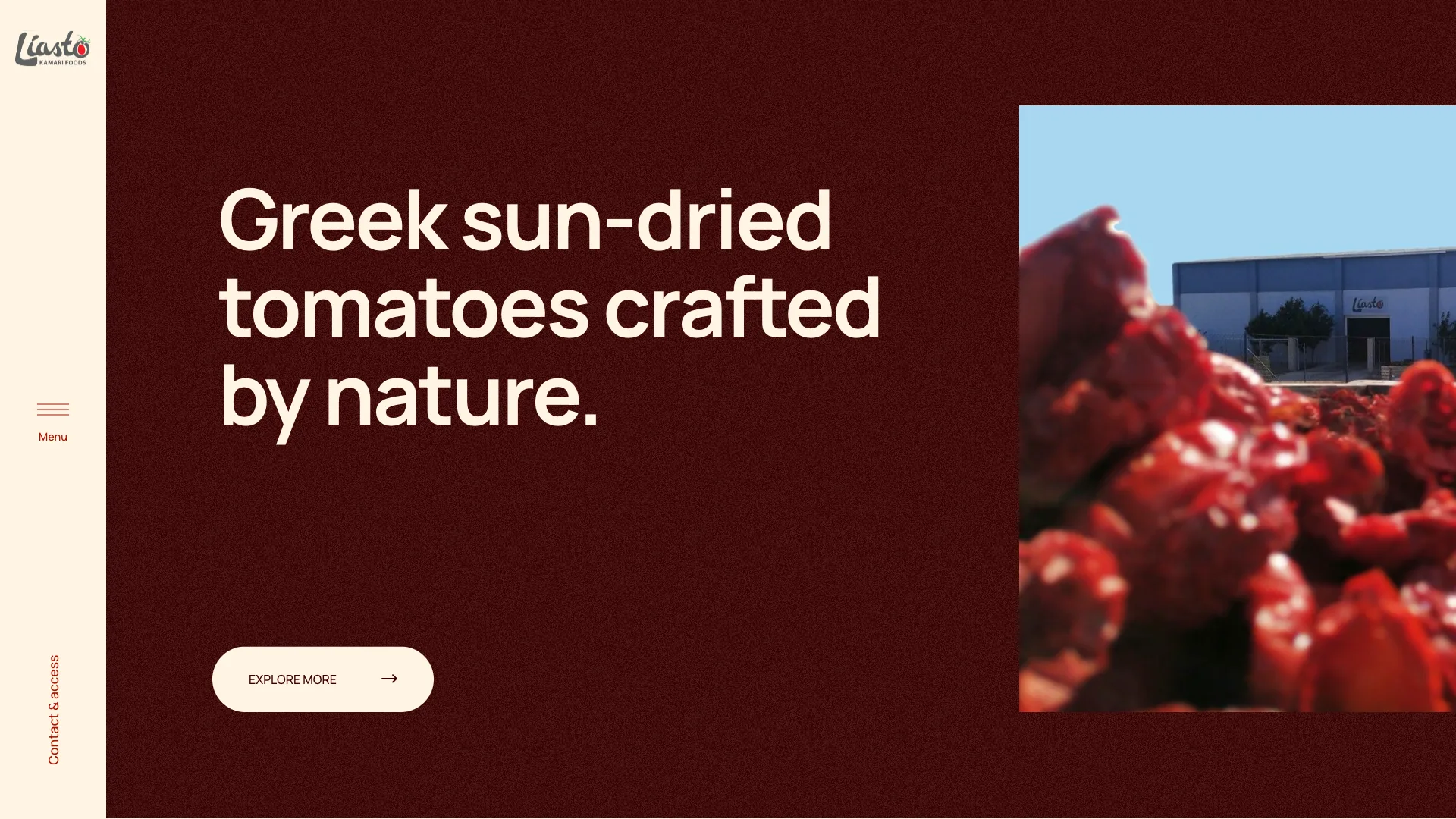
The visual direction comes straight from the product: a deep, sun-dried-tomato red with a subtle grain, warm cream and large, calm typography. Real photography of the drying fields, the facility and the products carries the story, so Liasto feels like a producer, not a stock-photo food label.
Typography stays quiet and generous, letting the photography and the colour do the work, while small details like the grain texture and the hand-drawn logo keep it warm.
A horizontal journey from field to jar
The dilemma
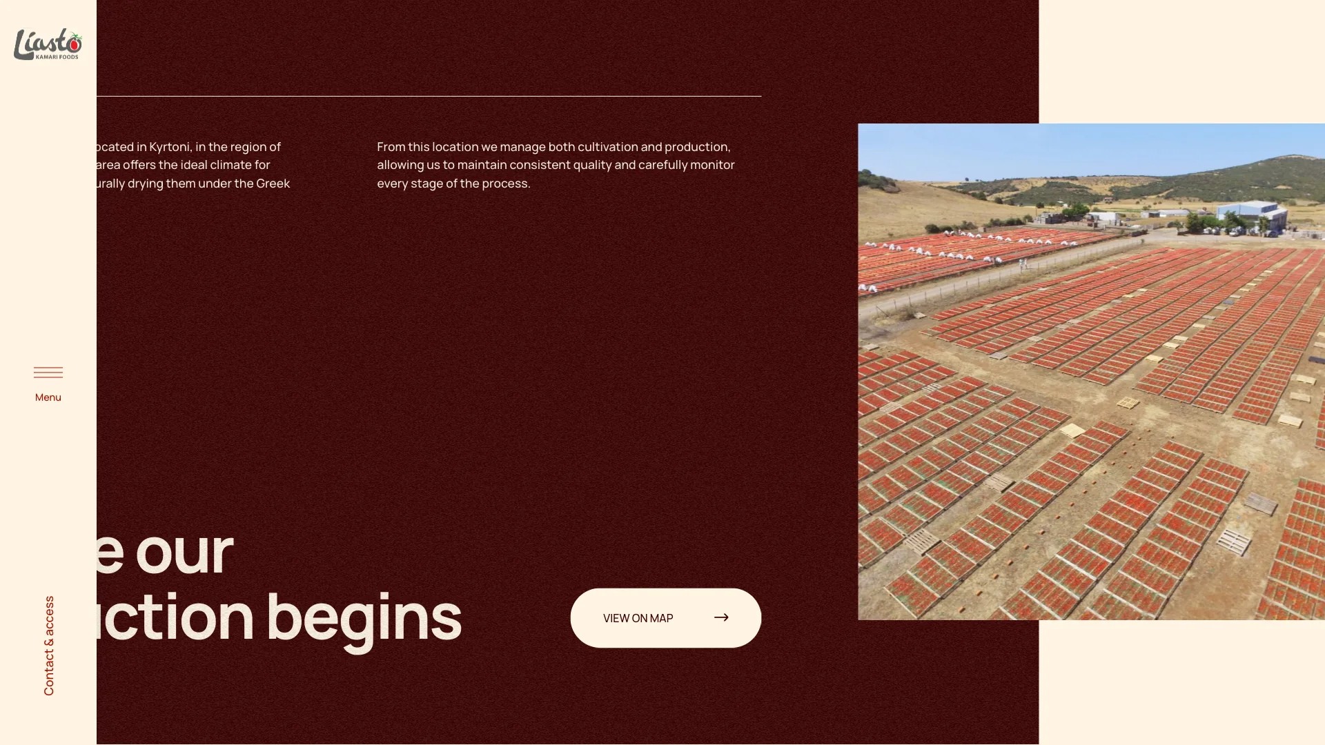
Liasto's strongest selling point is the process itself: it controls every step from seed to jar. On a long vertical page full of text, that story is easy to skim past.
The decision
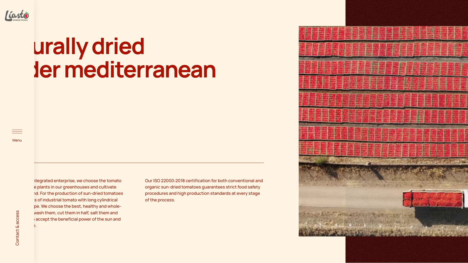
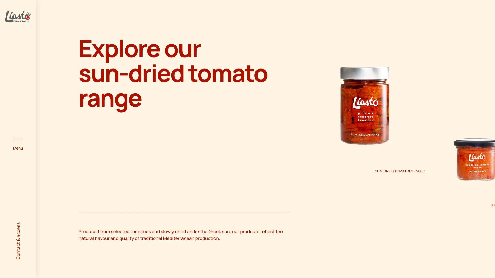
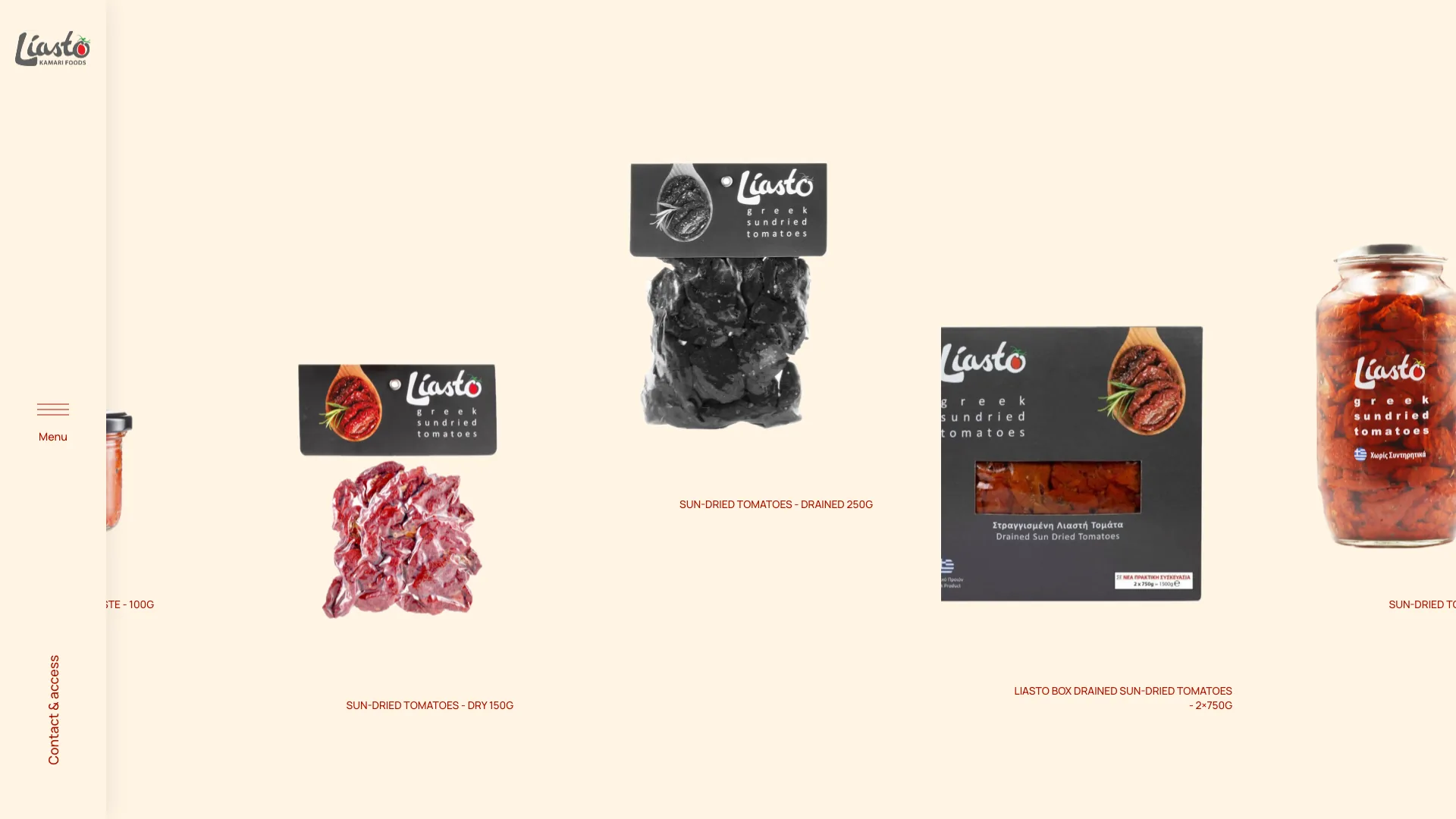
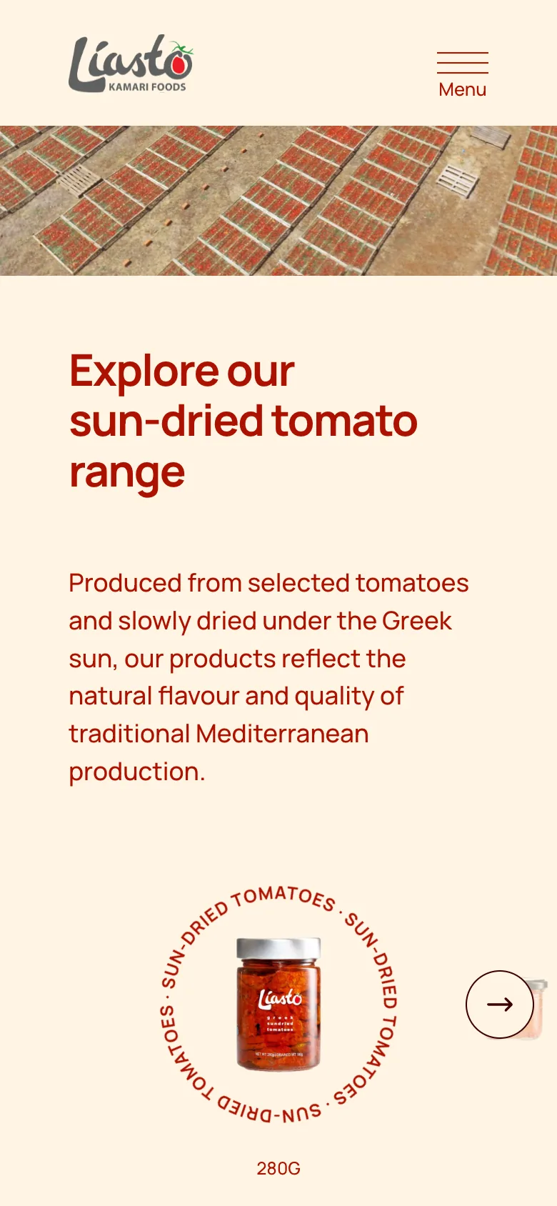
On large screens the homepage scrolls horizontally as one continuous journey: sun-drying, the production site in Kyrtoni, the product range and the B2B offer, ending with the ways to get in touch. On smaller screens it becomes a regular vertical page.
Why it mattered
The order of the page follows the order of production, so visitors understand the vertical integration before reading a word about it.
Trade-off accepted
A less conventional scroll on desktop, in exchange for a memorable, story-led first impression.
Speaking to business buyers first
The dilemma
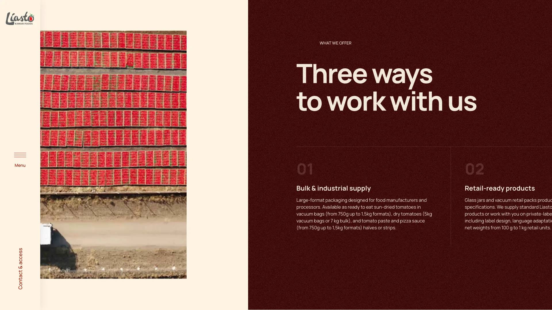
Liasto supplies food producers, distributors, retailers and foodservice businesses. A typical producer website talks to shoppers and leaves these buyers looking for formats, specs and terms.
The decision
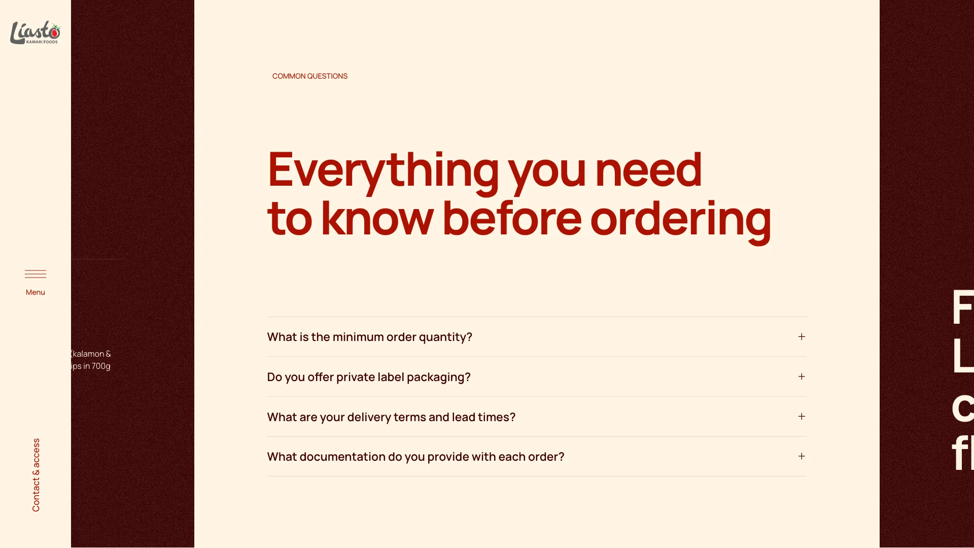
A dedicated B2B page sets out three ways to work together (bulk and industrial supply, retail-ready and private-label products, other products) with formats and weights, followed by the questions buyers ask before ordering.
Why it mattered
Buyers can qualify Liasto as a supplier on their own: minimum quantities, private label, lead times and documentation are answered before the first email.
Trade-off accepted
More detailed, text-heavy content than a typical brand site, in exchange for fewer back-and-forth questions.
One range, two audiences
The dilemma
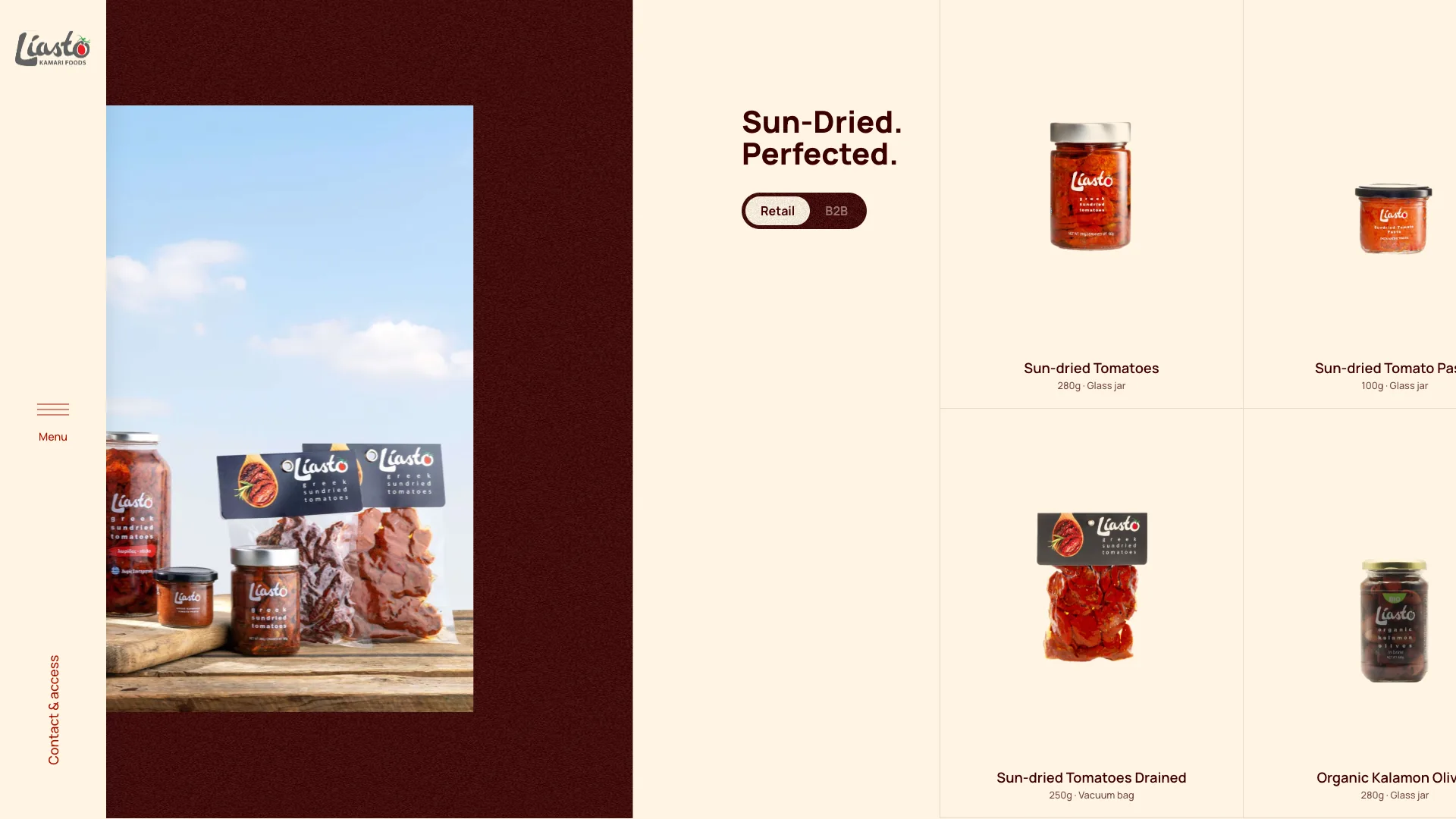
Retail jars and bulk foodservice packs are different products for different people. Listing them together would make both harder to browse.
The decision
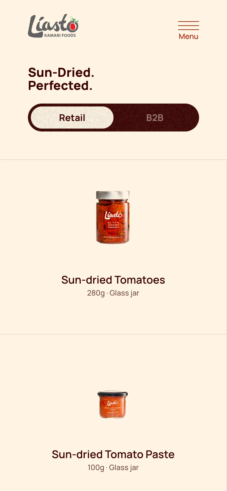
The products page has a simple Retail / B2B switch, so each audience sees its own formats, from 280g jars to 1.5kg glass jars and vacuum bags.
Why it mattered
Shoppers and buyers each find what's relevant to them in one place, without two separate catalogues to maintain.
Trade-off accepted
One more interaction on the page, in exchange for a clearer catalogue.
Always one step from a conversation
The dilemma
For a B2B producer, the goal of almost every visit is a conversation, yet contact details usually hide in the footer.
The decision
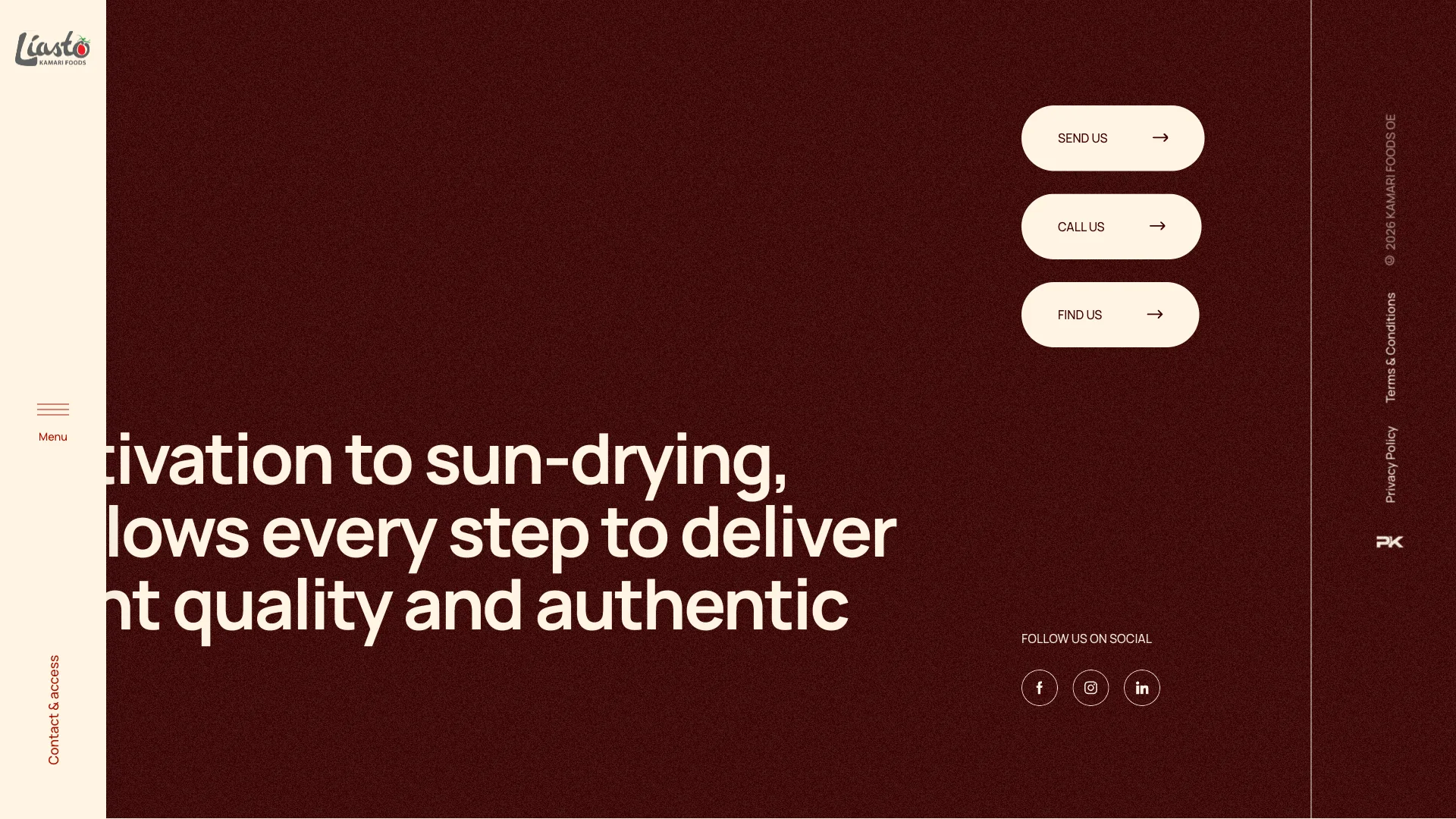
A fixed sidebar keeps “Contact & access” visible on every page, and every page ends with the same clear close: send an email, call or find the facility on the map.
Why it mattered
Wherever a buyer is convinced, the next step is one click away.
Trade-off accepted
A persistent element that takes a little horizontal space on desktop.

Built for every screen
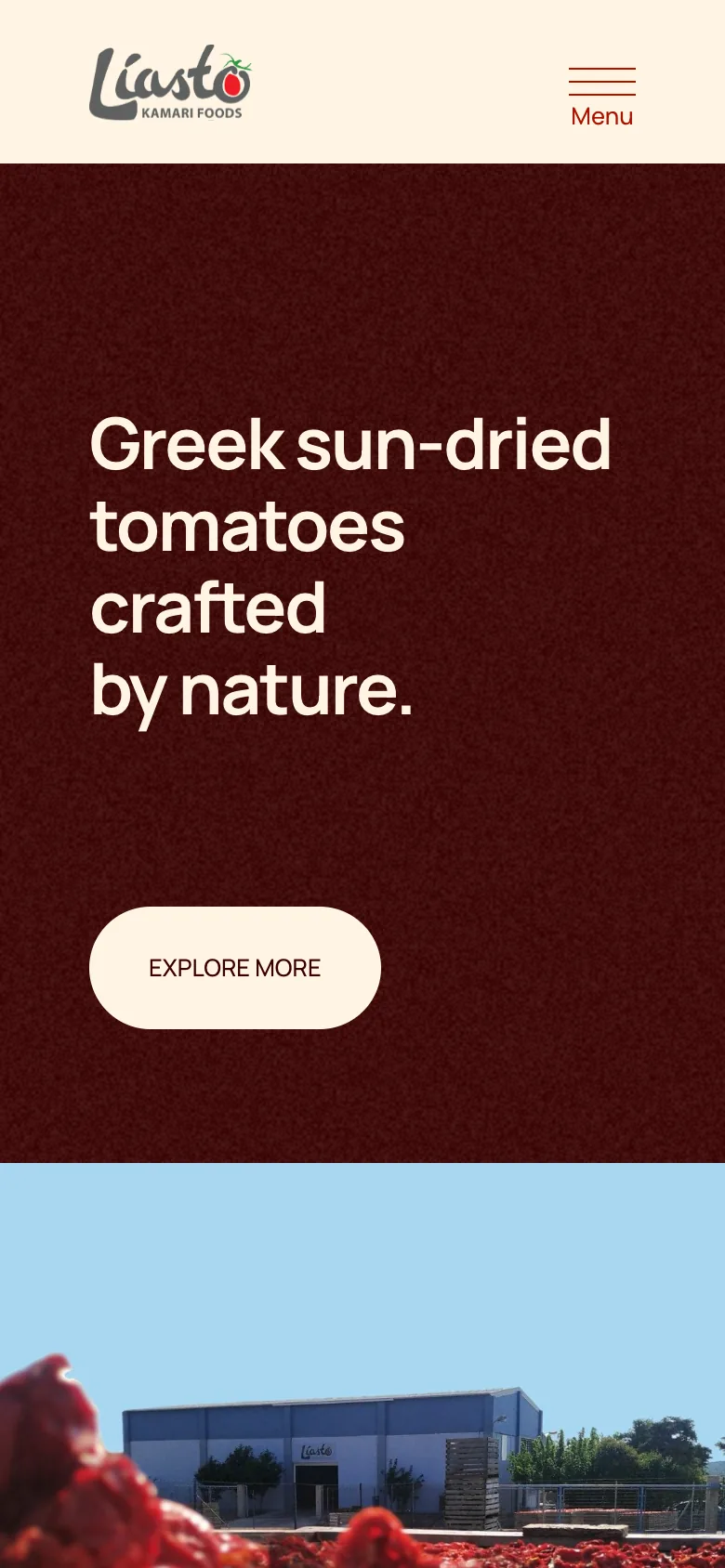
On phones and tablets the horizontal journey becomes a vertical one, the sidebar turns into a compact top bar, and the product range becomes a swipeable carousel.
Learnings
Designing and developing Liasto end-to-end meant the motion, the horizontal scroll and the responsive behaviour were shaped in the browser, not only in mockups, and could be tuned until they felt natural.
It also reinforced that for a B2B producer, the most persuasive content is the work itself: showing the fields, the process and the formats clearly does more than any claim.