2 therapies
2 locations
A space that feels safe before the first session
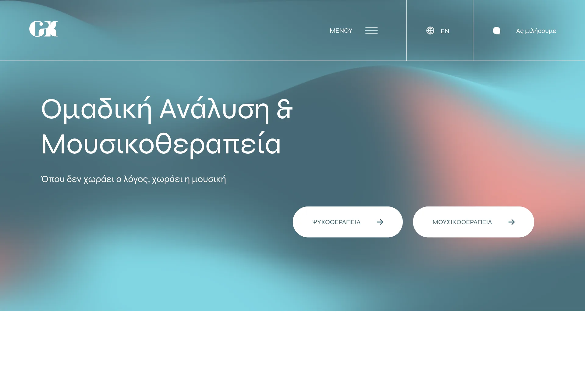
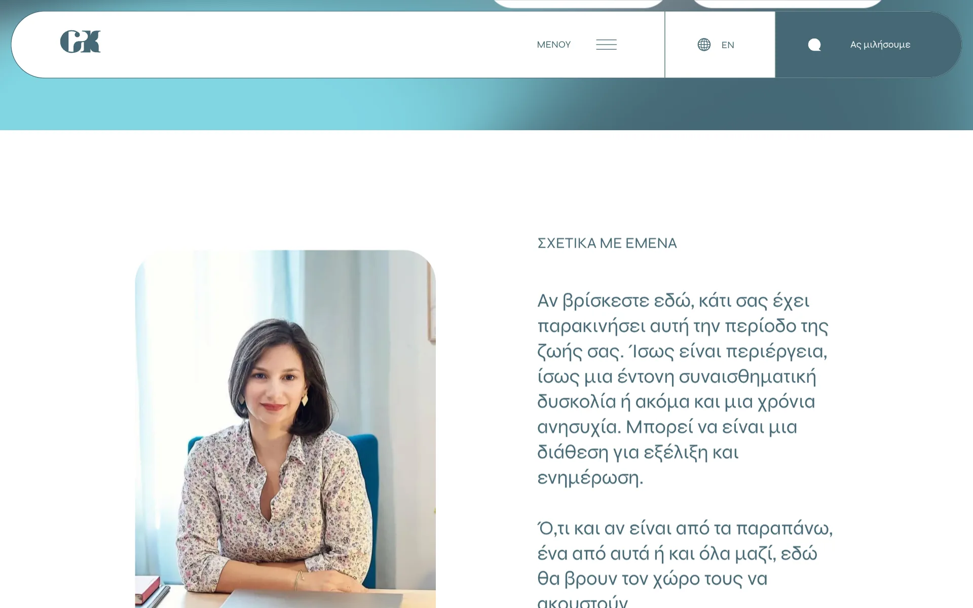
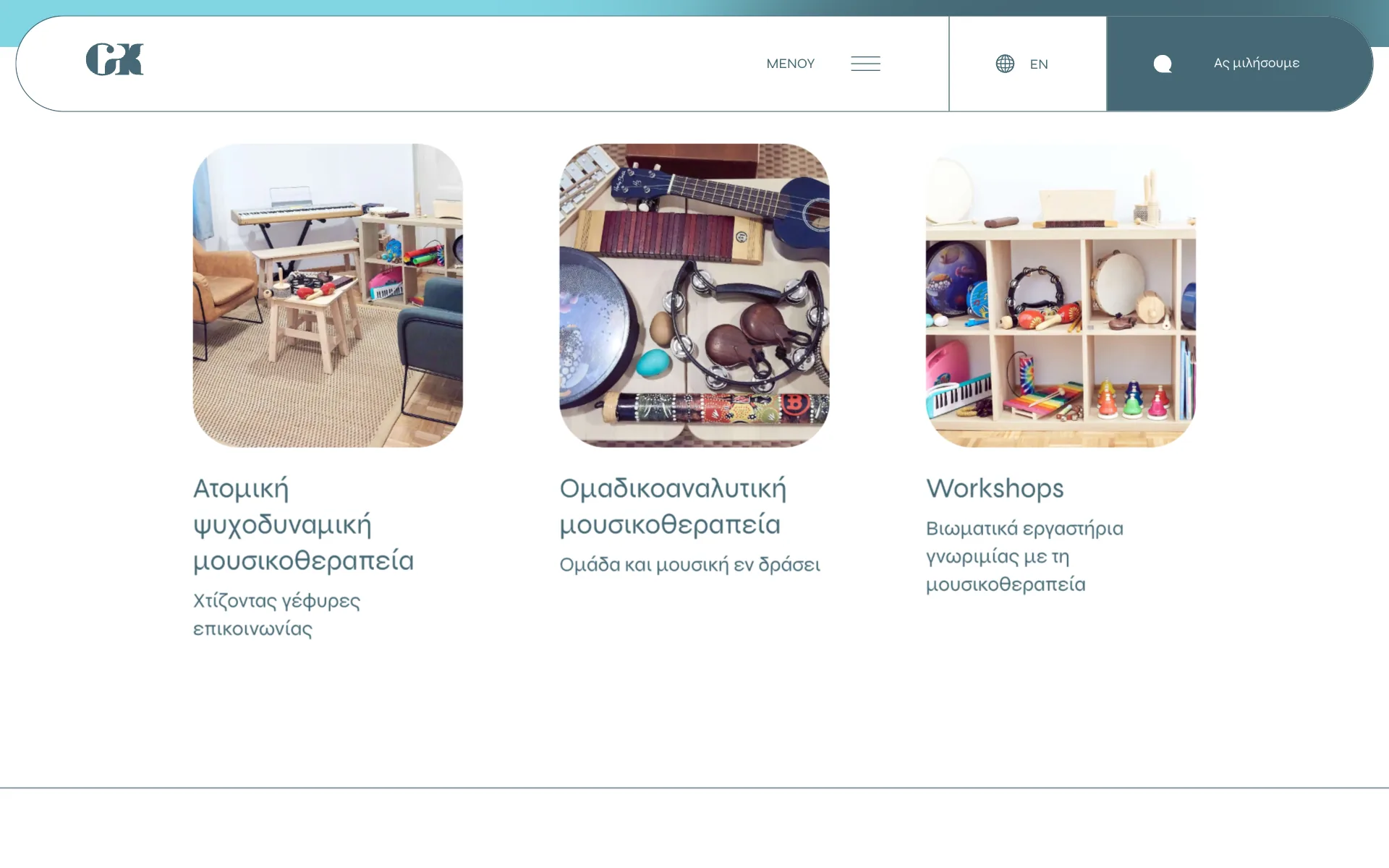
People often arrive at a therapist's website at a difficult moment. The design aims to feel calm and human rather than clinical: a soft, flowing gradient in teal and coral that hints at sound and movement, generous whitespace, light typography and real photos of the therapy rooms and instruments.
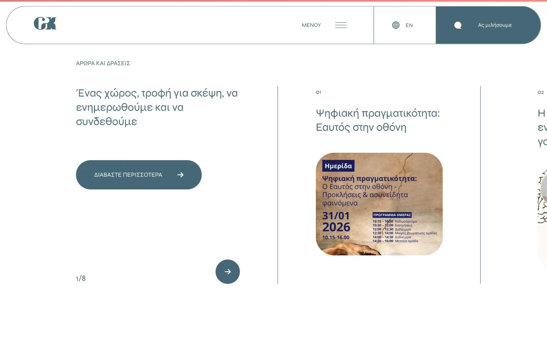
A floating header keeps the menu and a gentle call to action, “Let's talk”, always within reach, without pressure.
Two fields, one clear structure
The dilemma
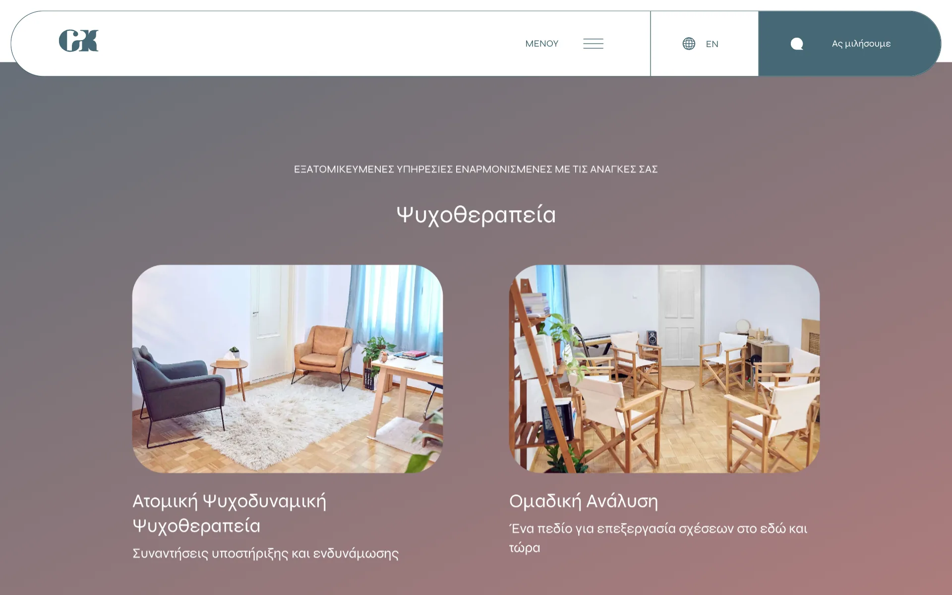
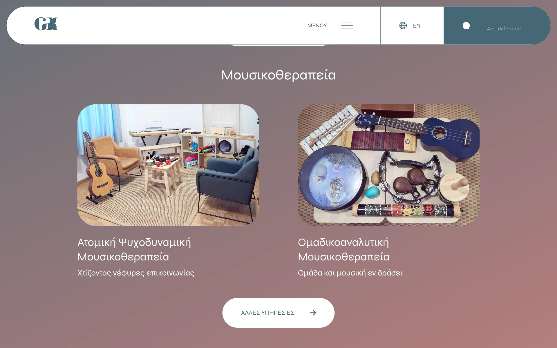
Konstantina works in two related but distinct fields, psychotherapy and music therapy, each with individual and group formats. Mixing them would make it hard for visitors to find what applies to them.
The decision
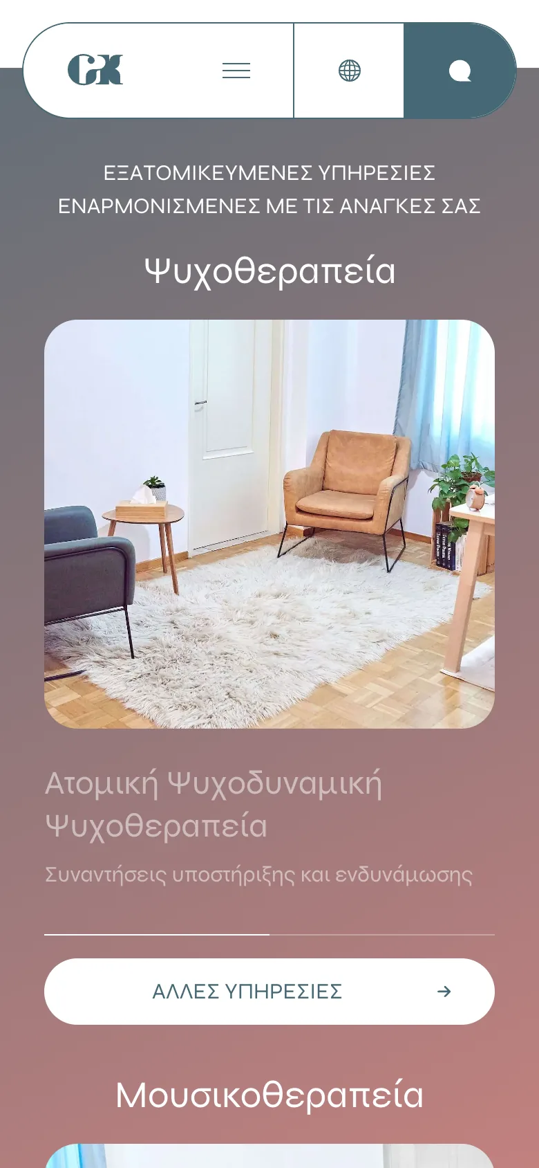
The site is organised around the two fields. Each has its own section on the homepage and its own page, listing individual and group work along with related offerings such as online sessions, seminars and workshops.
Why it mattered
Visitors recognise what they're looking for at a glance and only go deeper into what concerns them.
Trade-off accepted
Some repetition between the homepage and the service pages, in exchange for clearer paths.
Built for every screen
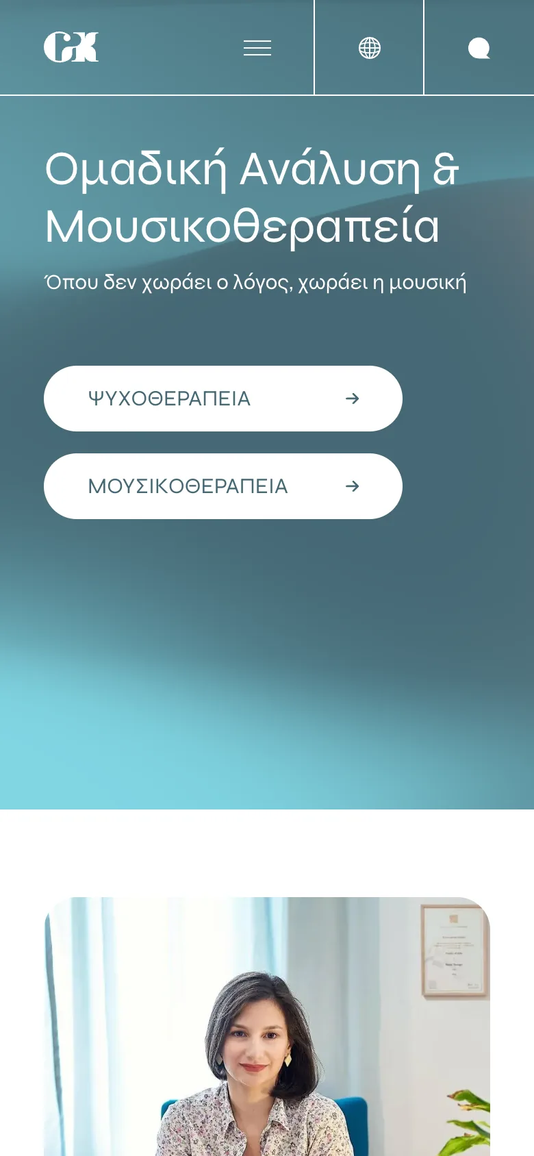
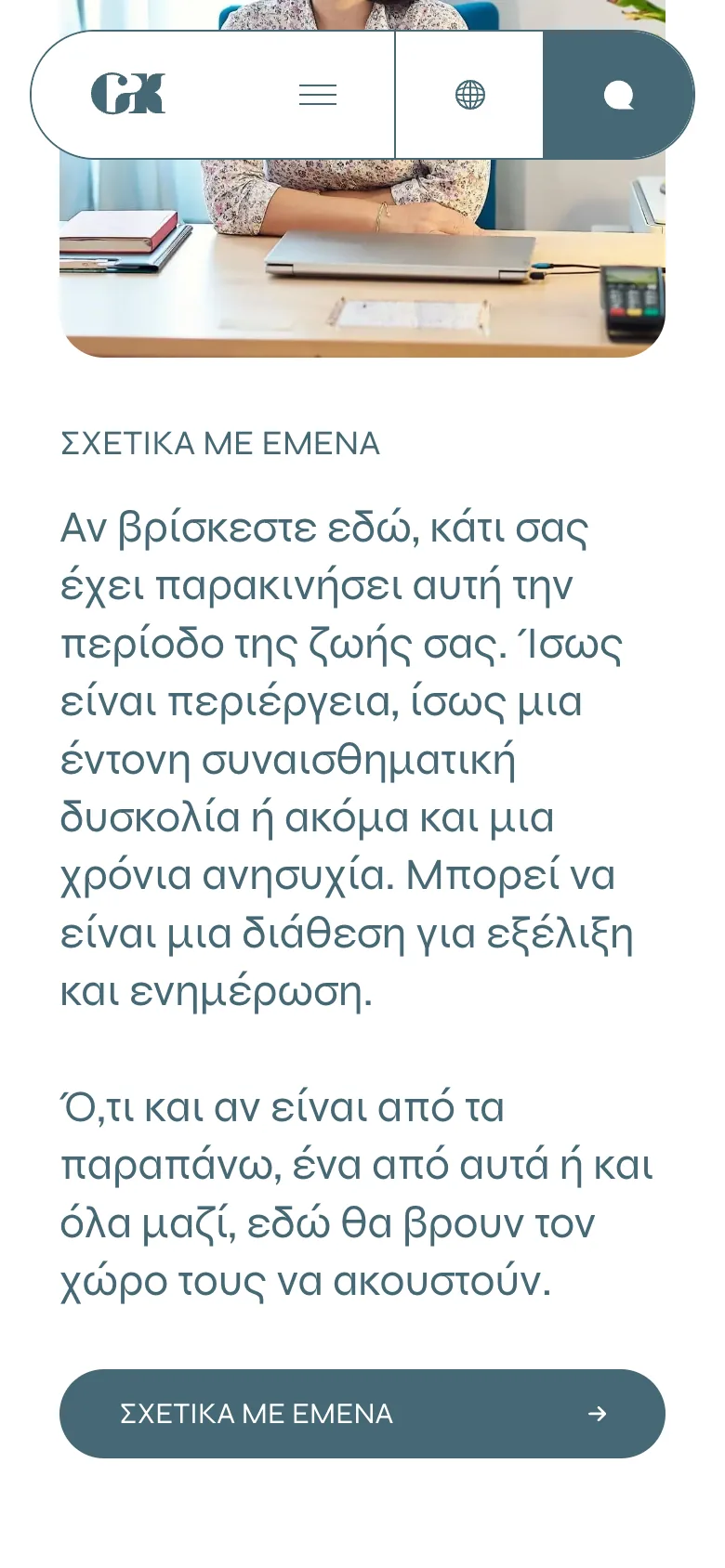
On phones the floating header becomes a compact bar, sections stack into a single column and the contact options turn into large, easy-to-tap buttons.
Learnings
Designing for mental health is largely about what you leave out: no pressure, no clutter, no clinical coldness. Restraint in colour, motion and copy mattered as much as any feature.
Designing and building it myself meant the motion and smooth scrolling could be tuned in the browser until they felt calm rather than showy.